Bradford lads.
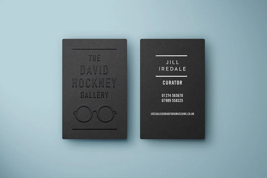
I developed this David Hockney exhibition identity for Cartwright Hall, to celebrate his Bradford years along with directional signage and stationery.

———— Fonts date so quickly. They depict an era of what is vogue typographically at that time. I wanted to choose a cut of Futura Bold which is timeless, however after researching publications and other print-related Hockney literature, Futura is the go-to-font. I opted for Trade Gothic, to reflect some of Bradford’s Industrial past, its clean, unfussy and will date slowly. Time will tell.